Thoughtful Apps Need a Story (And a Launch Trailer)
With so much of app development and user interface design being standardized with declarative programming, design systems and UI kits, things start to look the same and it’s becoming harder to stand out.
One aspect I only recently put into words is how great apps have a sense of story behind them. A sense of history. That it’s part of a larger universe. Even if you’re just seeing its icon or onboarding screen, you get the feeling that you’re only scratching the surface of something much bigger.
And this is usually the case. During more involved development there’s a lot work that goes unseen. A lot of design concepts, prototypes and ideas that remain hidden from the world. But in the minds of the people creating the app, it all adds to the story. So when time comes to execute the app icon or the welcome screen, you can just tell that a lot of care and thought went into it. Perhaps it’s intangible, but I believe you can feel it.
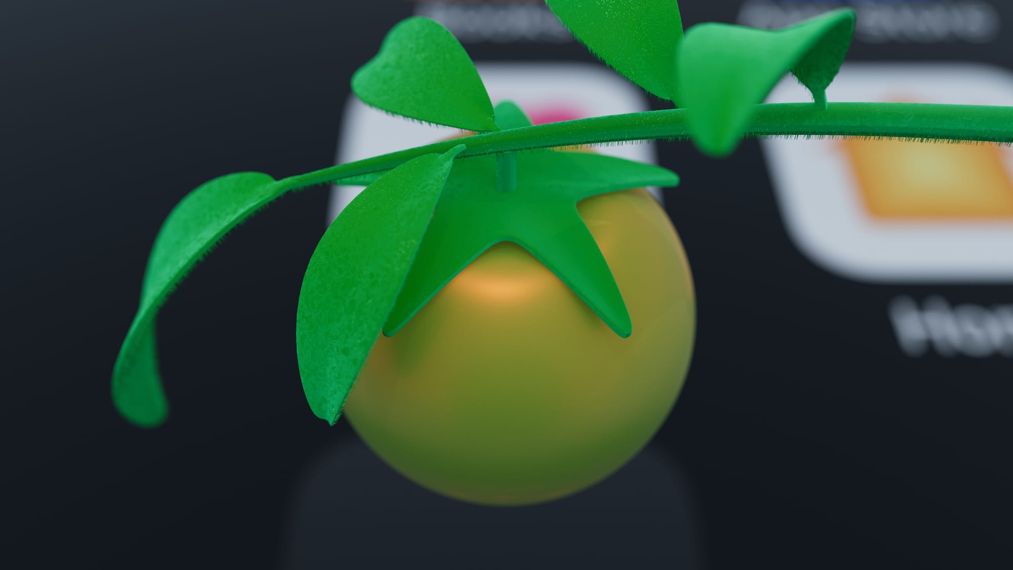
An example of this is an upcoming app we are working on internally, dubbed Tomat (Swedish for tomato). We’ve been making cooking apps as side hustle over the years and it’s a great way for us to try ideas and learn new things. Tomat remixes our previous efforts with a focus on user created recipes first. When contemplating the design of it, I went back to the very first app we made; Veggie Meals. It had a carrot and a tomato for icon, back in the iOS 6 era. So that tomato has a long running history for us. It’s a very iconic vegetable.
To get started with the new icon I first prompted Midjourney for ideas. The following initial sketches were done right in Figma in my App Store template. Turning its leaf into something that resembled a star was a fun idea that could convey how the app contains your favorite recipes. I then recreated it in Cinema 4D which added a final level of fidelity, with final touches in the old work horse Photoshop.
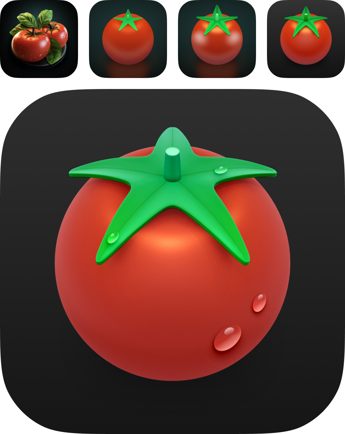
Making an icon inside of Cinema 4D has the added benefit that it becomes relatively easy to animate it. So naturally I eventually turned it into a teaser trailer for the app.
Tomat teaser trailer
This is still early in the development, but you can imagine how an artifact like this trailer gets the team excited and aligns our vision going forward.
I’ve had similar experiences in the past. At Quill, making a new icon for the Mac client turned into a similar teaser trailer of a floating feather that gracefully lands in the macOS dock. It got the team excited and piqued the interest in the community. I love how the piano track builds excitement.
Quill teaser trailer
I can think of similar world building apps.
When the Lux team launched their app Orion, which is a utility to use your iPad as an external HDMI display, they went the extra mile and created a design narrative that adapts a theme of 80s VCR tapes and builds on top of that nostalgia with its icon resembling an old CRT TV and a literal unboxing of the app.
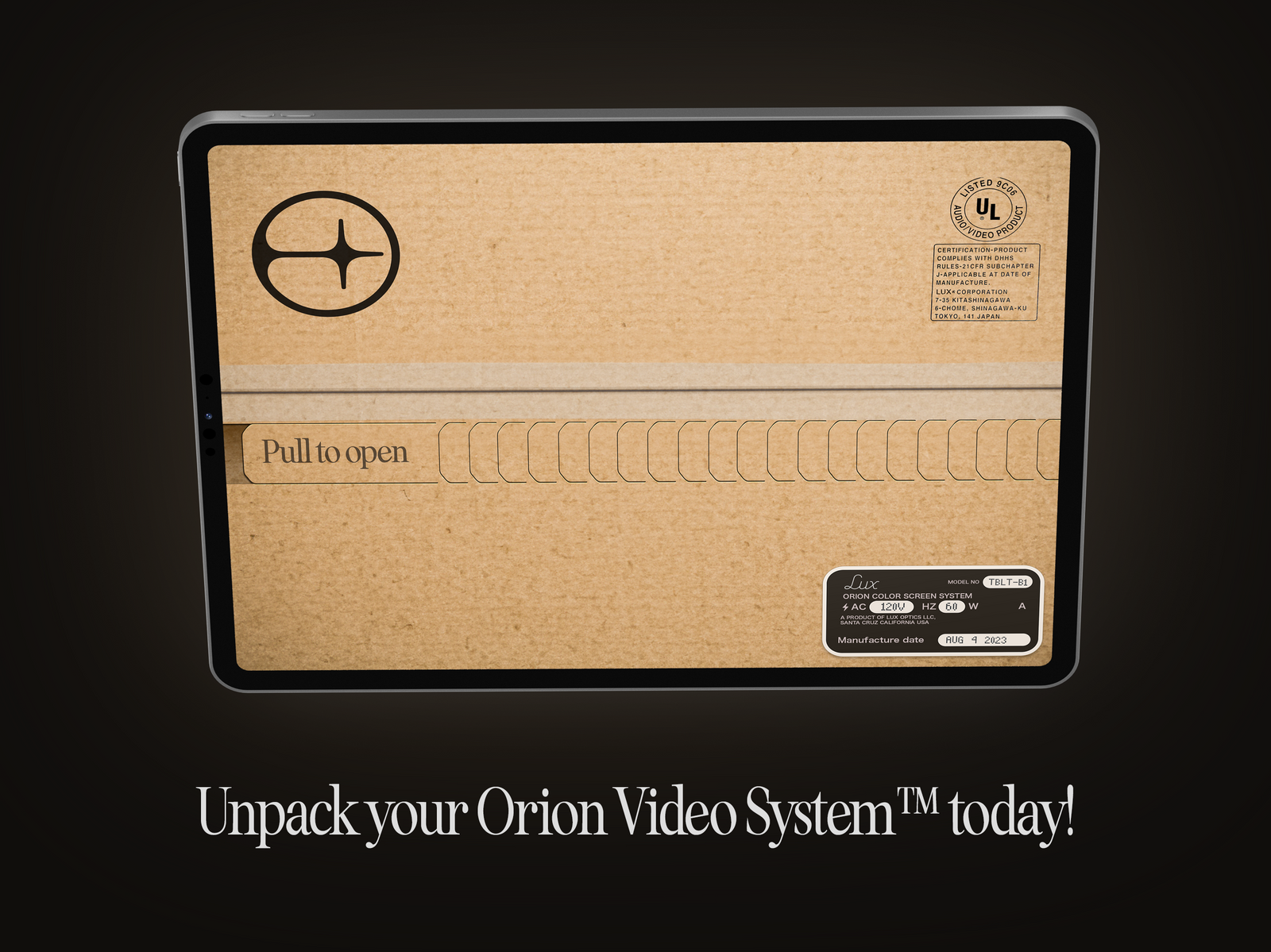
Of course this is not to say all apps need involved back stories. But it’s another tool in your utility belt as a designer or developer.
And this world building needs to be followed up and executed on inside of the experience with animations, haptics, custom icons and possibly sounds. On top of a well-thought out user interface and easy-to-understand flows.
If you need help building out your app universe — reach out!

