For Great App Icons, Iteration Makes All the Difference

App icons are art. Getting a great app icon for your app can be a process. Even with a clear idea in mind, you'll need to iterate. If you hire a designer this can be done during a focused design phase, or as an indie developer it may be something you do yourself and it can take place over the course of years.
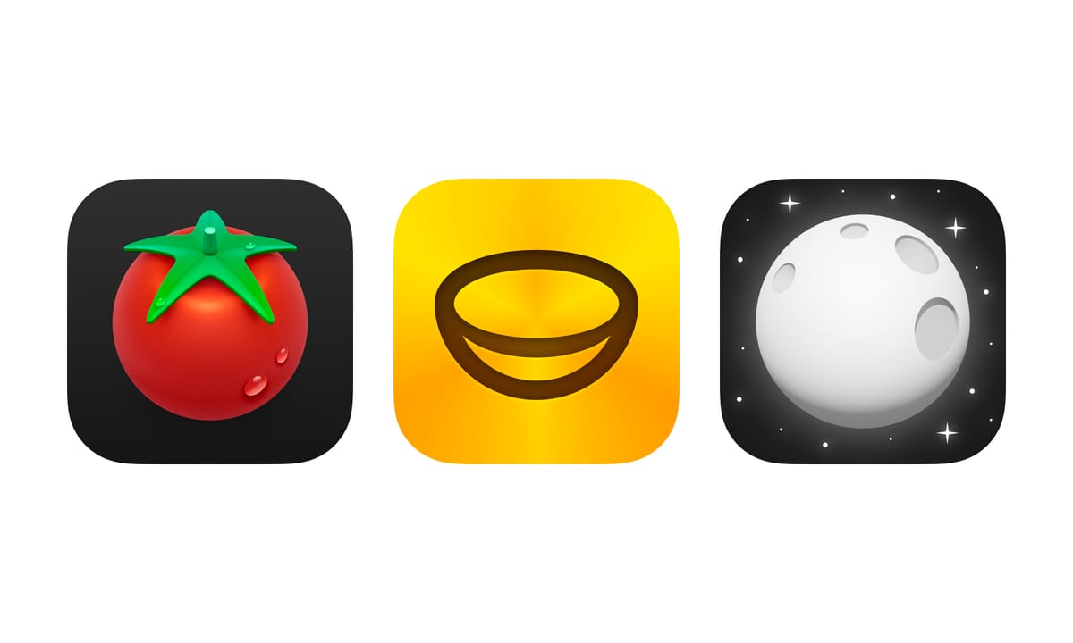
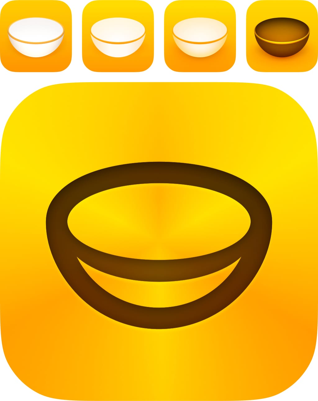
One such example is our own app Plantry. The idea for the app icon was clear from the beginning. Depict a simple and iconic item related to serving food; a bowl. The bowl itself was modeled in 3D and is a sphere sliced in half, sitting at an angle. The first versions came straight out of a 3D render. Eventually it was redrawn inside of Sketch for a more illustrated look. It was then tweaked to increase the sense of depth. Even though it's very harmonic, the white bowl on yellow didn't stand out so well when browsing the App Store. So an inverted version was made. And most recently we went the simplistic route of using the glyph version of the bowl — still based on that original 3D perspective. To make it interesting a classic method of angular gradients is used to make it look almost golden.
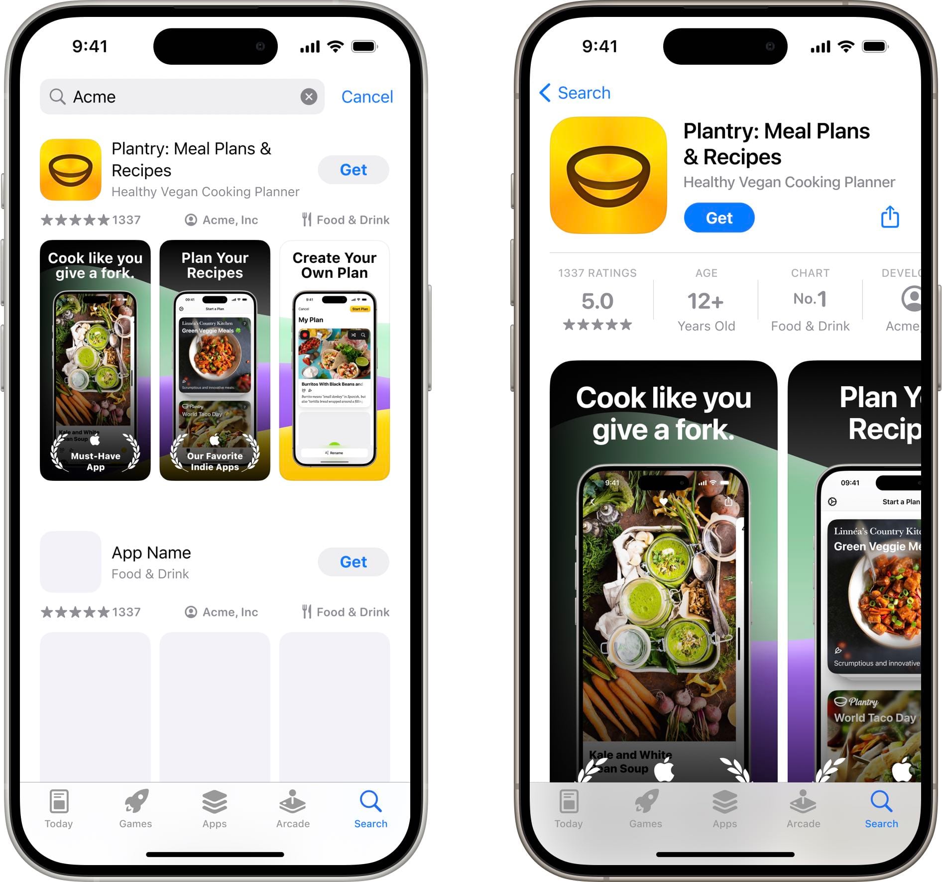
An icon is never seen in isolation of course. I like to continuously try an app icon in its context. Probably the most important being the App Store. Here it's also important to consider how the icon plays with the screenshots. I use my iOS App Icon template to quickly try different directions. For Plantry, the yellow of the icon is picked up in details in the screenshots, and complementary colors help to make the whole look interesting.
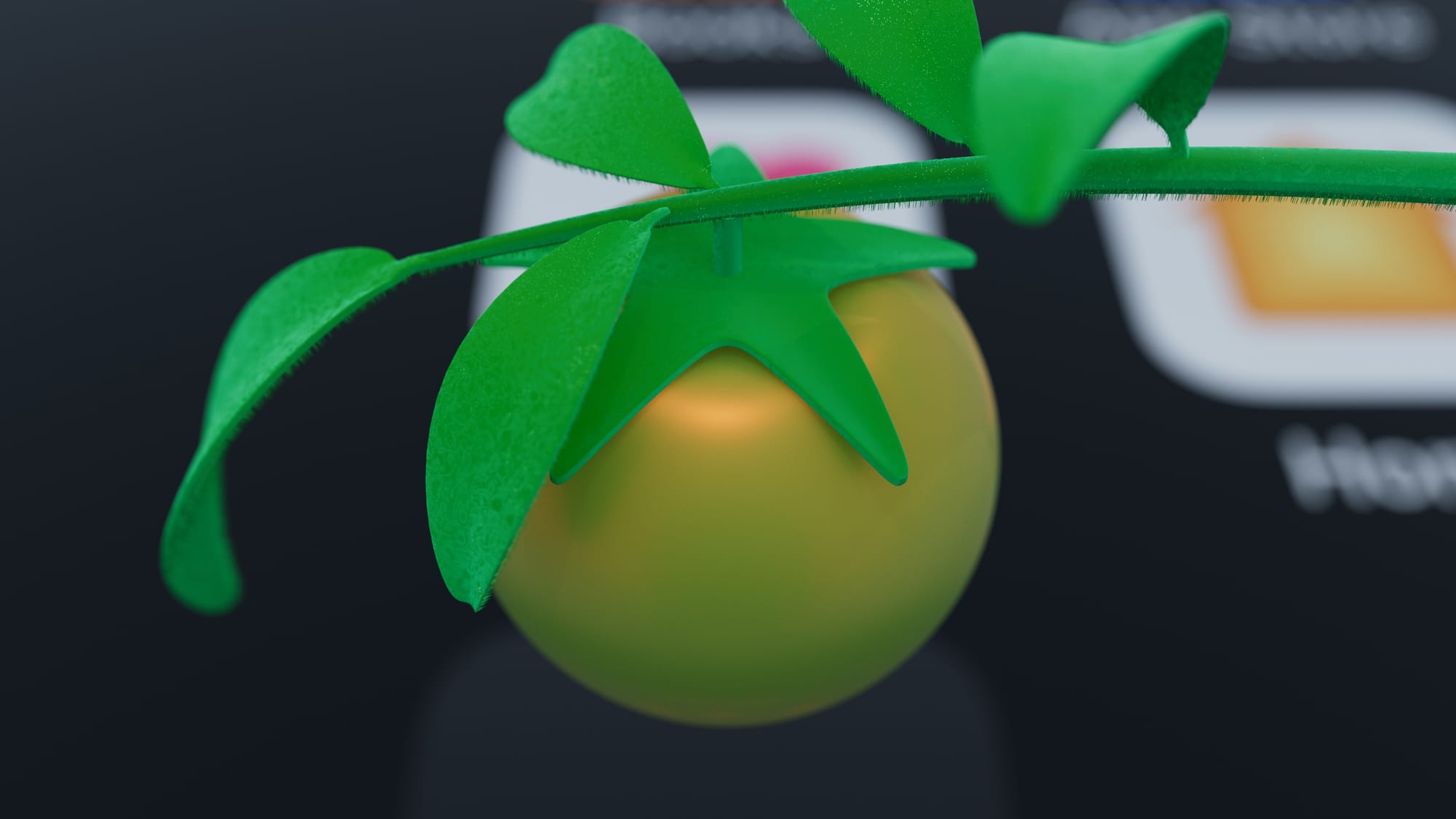
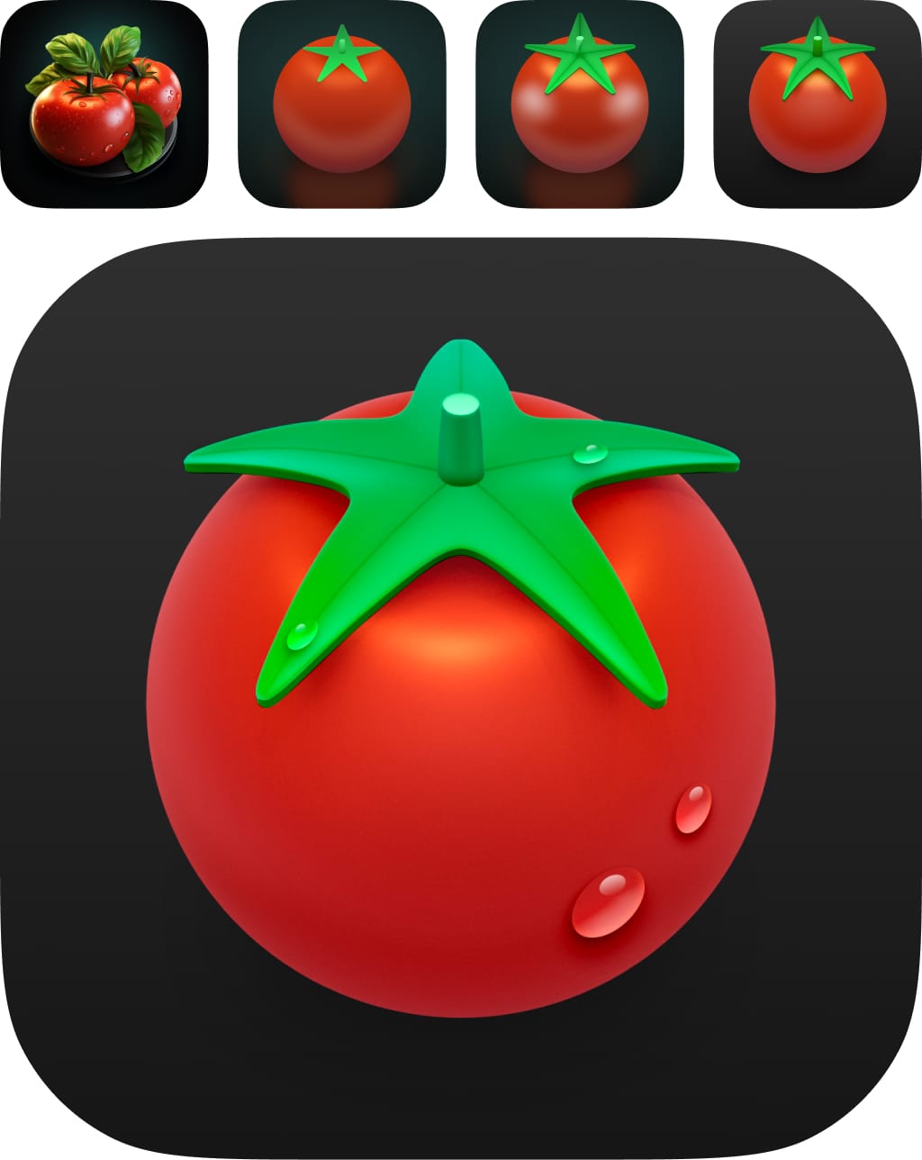
Another example of our own is for an upcoming app called Tomat. It has a very iconic tomato at the center. To get started with the new icon I first prompted Midjourney for ideas. The following initial sketches were done right in Figma. Turning its leaf into something that resembled a star was a fun idea that could convey how the app contains your favorite recipes. I then recreated it in Cinema 4D which added a final level of fidelity, with final touches in the old work horse Photoshop.
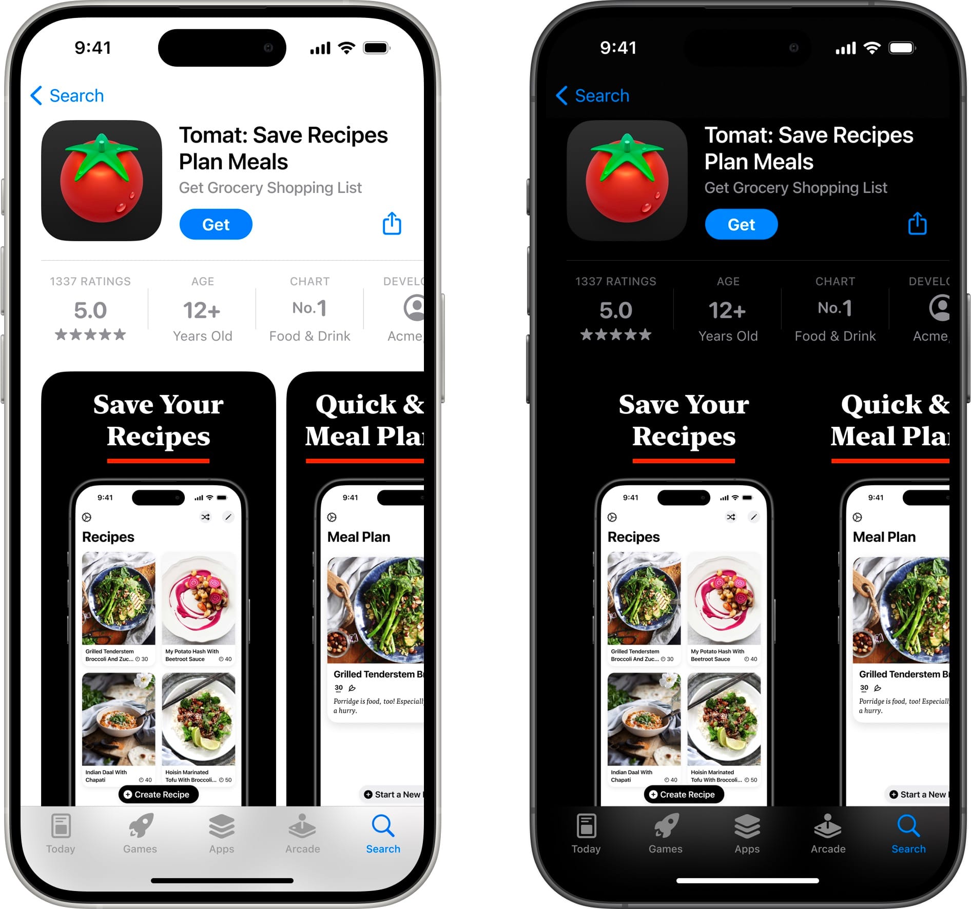
For the App Store, the screenshots plays off of the icon by using the same simple color palette with a red detail that underline each screenshot title.
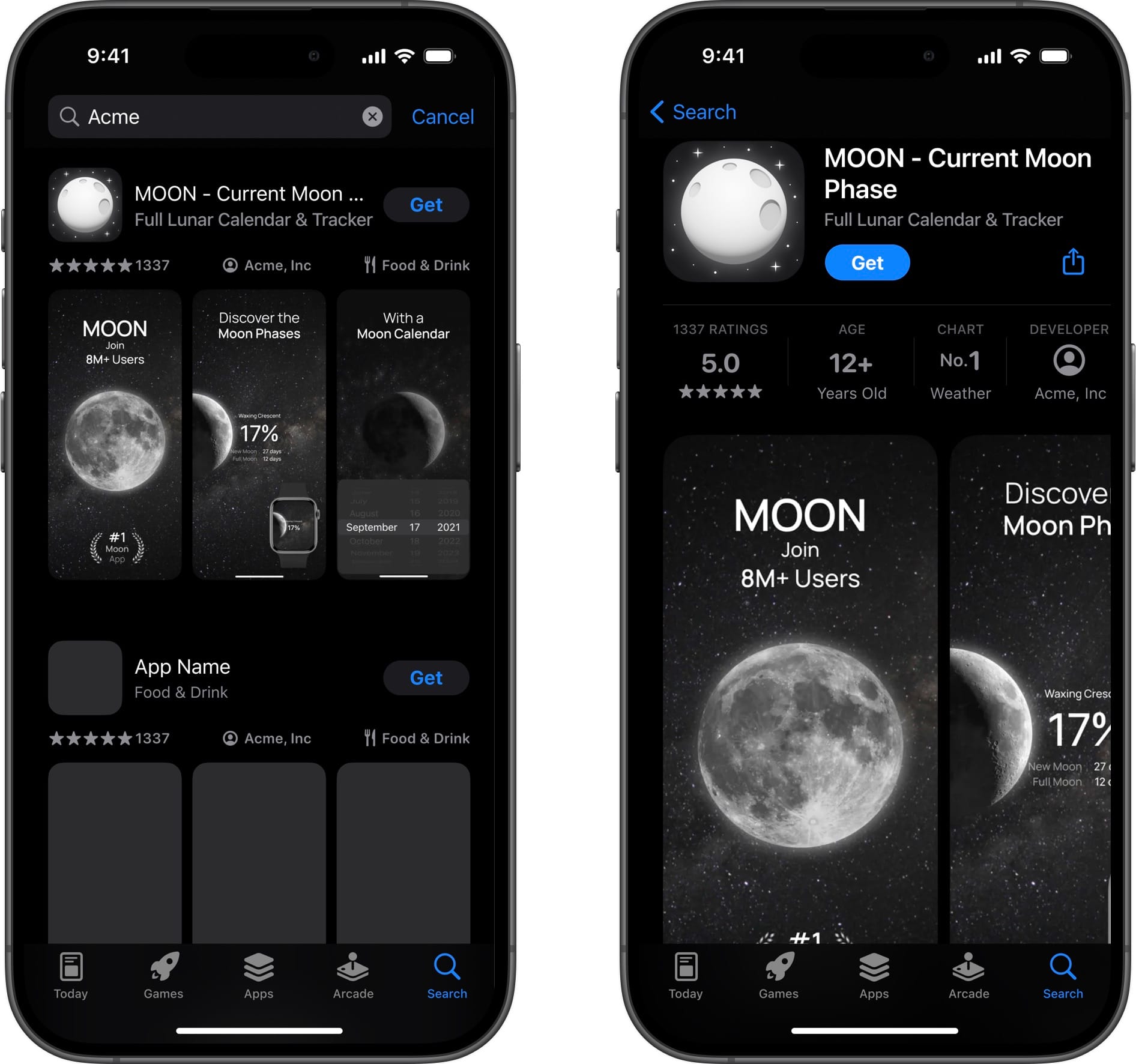
When it comes to making icons for clients, I like to work iteratively with fast feedback loops. When MOON approached us to help with their icon they were specifically looking to try new directions with a realistic style as well as illustration based directions.
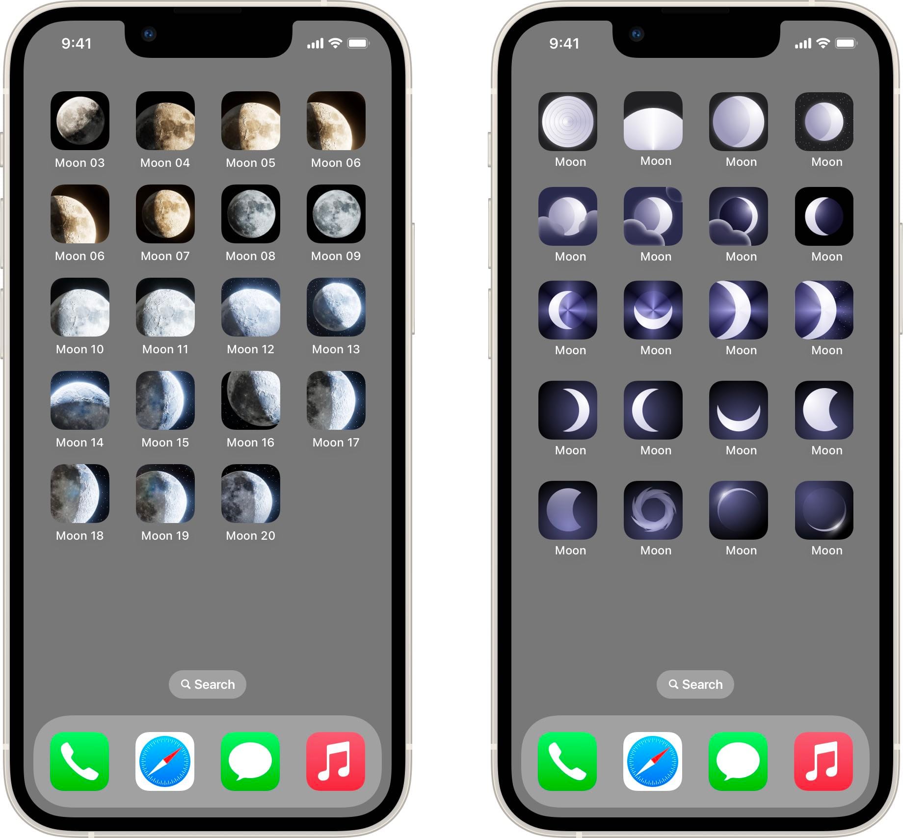
For the initial round of iterations I set up a 3D scene of the Moon using NASA imagery and a sun light source that allowed me to try a photorealistic style at different angles and light sources with ease.
Round 2 took a very different direction of using more abstract ideas of a moon, with inspiration from the 2009 movie Moon, and the iOS weather app.
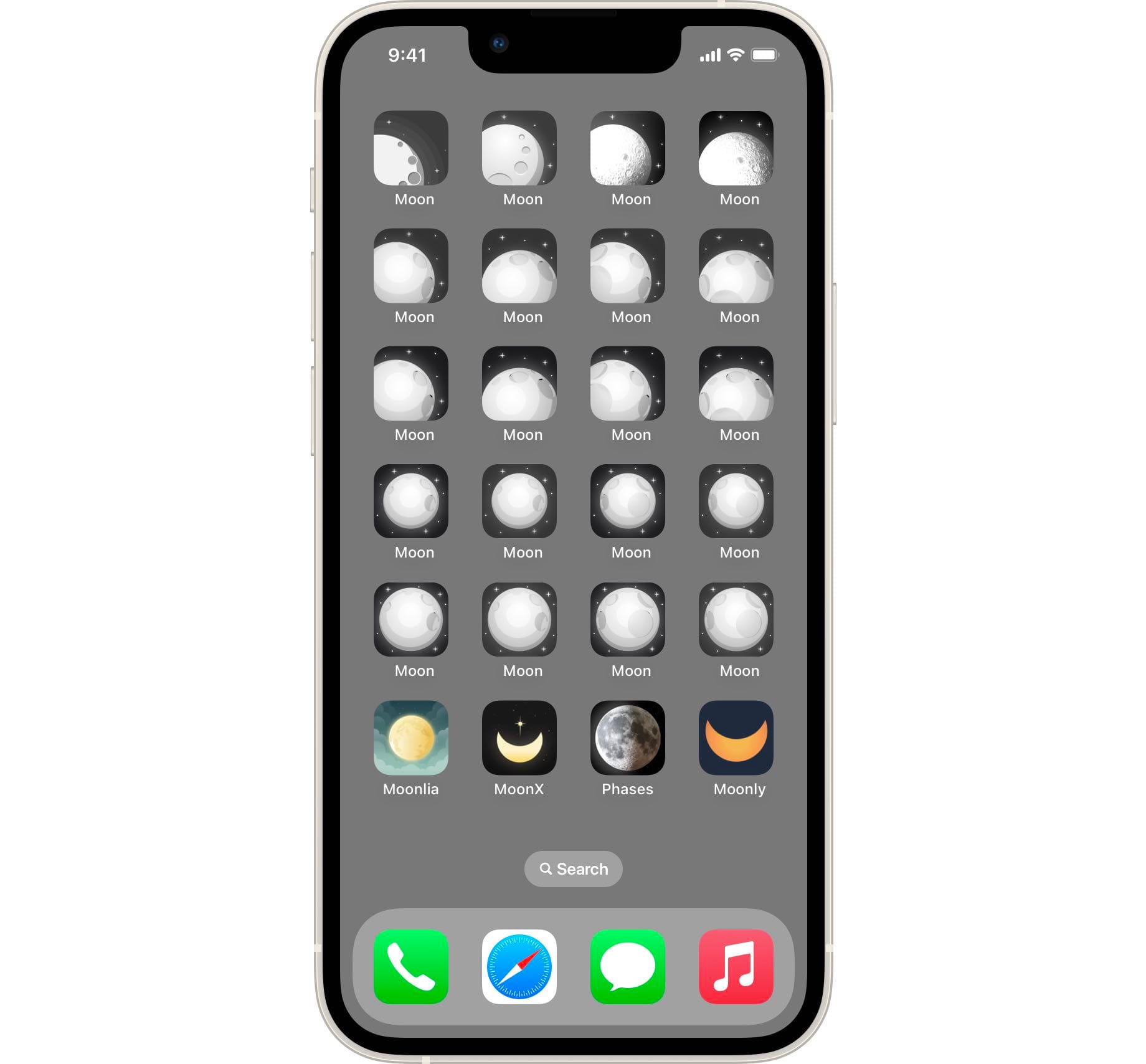
After exploring new directions, the client wanted to return to their roots. With their current icon as a starting point (top left), we explored a monochrome direction that evolved the style. The bottom row shows the four main competitors the client specifically wanted to stand out against. By using a 3D sphere it was possible to create craters with proper perspective.
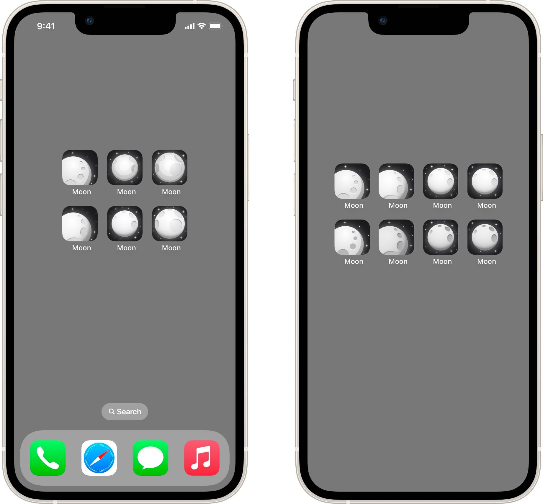
The client picked 3 icons we iterated on to give them smooth shading. They were then made into four options they will run in an AB test. Typically I enjoy letting my taste decide the final outcome, but it will be interesting to see what their test results in.
Even though the final icon ended up close to their original version, trying new directions and setting up that 3D scene clearly influenced and helped achieving the final options.
Again, the app icon plays well with the screenshots to make for a coherent impression.
The total time spent on the MOON icon landed around the 11 hour mark, across several days. While I enjoy long term projects where I can make a larger contribution, working on an app icon is always an enjoyable endeavor.
If you need help with your app icon, don't hesitate to reach out!