Sometimes, a Button Just Wants to Look Like a Button

How much was really lost in the great calamity that was iOS 7? For a UI designer like myself, quite a lot. I wandered around aimlessly for some time before finding my footing again. There was something so tangible with using real world metaphors for digital interfaces.
Modern design languages offer a lot of flexibility with their focus on fundamentals like typography, white space and simplistic icons. But sometimes, using an old school real world metaphor adds a lot of delight to an experience.
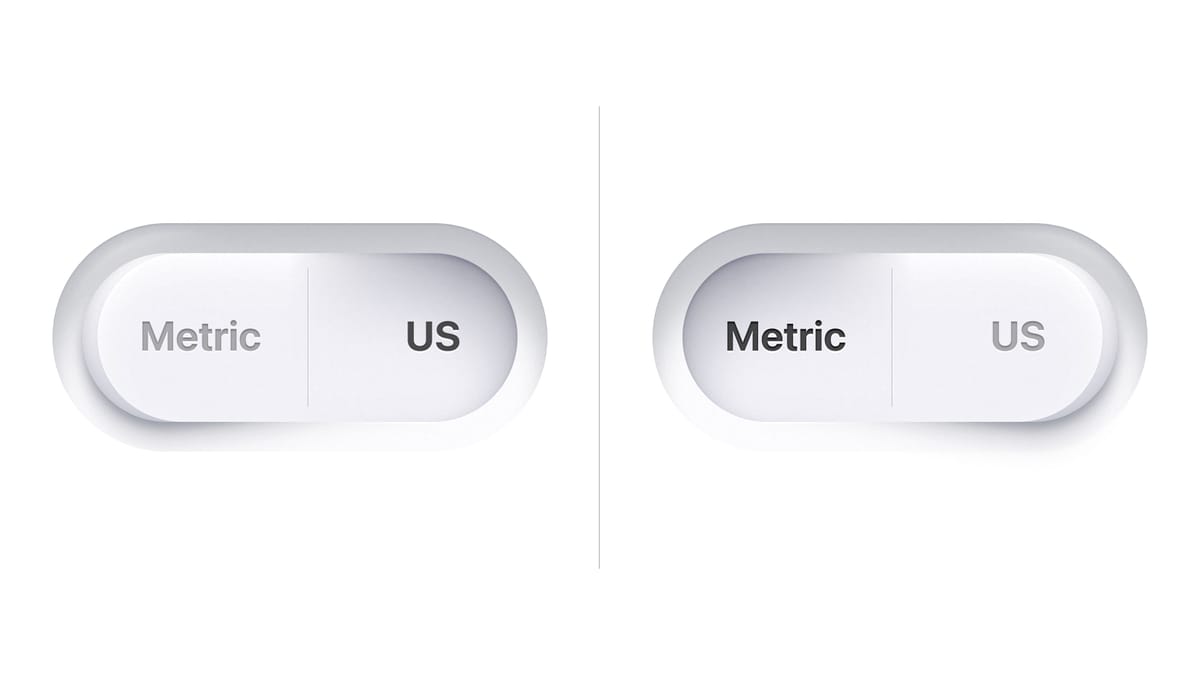
For example, a really tactile looking button can be so satisfying. With the addition of sounds and haptics, they can be really convincing, too.
This settings toggle is a way to present two opposing options, such as Metric or US measurements. In the case of the meal planning app Plantry, this fits in with the cooking theme since the button alludes to kitchen appliances. Even with the overall minimalism of a screen like this, a tactile button still fits. And it adds a lot of delight to an otherwise boring choice.
Plantry measurements toggle
But I get it. You feel like skeumorphism is not something we do any more. You wouldn't touch it with a ten foot pole.
Just having a shape around your button goes a long way to communicate that it's a button. And having it be a flat (or gradiented) shape lets you lean into digital benefits of changing shapes without breaking the mental model of a button.
For the shopping list app Handla, I made this prototype that puts a primary bottom button within easy reach of your thumb. It uses a shape fill along with a diffuse shadow to give you the feeling that it's lifted off of the background layer. The progressive blur on the background increases this feeling and makes it feel like it's in focus. The trick here is not to overdo the blur effect or it can be distracting. The button also has a plus symbol, adding one more signifier to it.
Handla grocery shopping list prototype
When you tap it, it morphs into the next primary button, a send button.
But shouldn't it be disabled when there's no text entered? iOS dictates that this is how a button should work after all. But actually, an active button is more accessible since a user may not always know what enables a button (in this case text entry). It's better to have a button always be active, and provide the user with an error message if they tap it without having completed all of the requirements. This is a general rule of thumb a usability guru once taught me.
In this case the entry field shakes to bring attention to itself. To be even more accessible it could highlight the placeholder text along with a message, but I felt it would be too much for this particular case.
I like that this button is similar in style to the Search button on the iOS Home Screen. And it's a nice mirrored shape to the Dynamic Island.
Straying away from buttons for a bit, another favorite of mine are sliders. Harking back to the magical Slide to Unlock that sold us on the iPhone in the first place, sliders can also be very satisfying when used appropriately.
In the Flourish Garden app, I used sliders to make the onboarding flow more engaging. The slider affects the screen itself which adds understanding and makes the experience more immersive.
Flourish Garden sun exposure setting
Finally I want to share this animation for Quill. It solves a common problem on team messaging services where the discussions wanders off and you want to retroactively move messages into a new thread. The physical metaphor of a stack of messages is both easy to understand and allowed for a very satisfying animation when rolling up several messages into a thread.
Quill message roll up
What UI in your app could be solved better using a real world metaphor, or with just a really nice button?
If you need help crafting delightful experience for your app, don't hesitate to reach out!


