Design Systems Are Meant to Be Broken

Design systems have had a big impact for teams to ship consistent product design. Consistency is great. However, I would argue that design systems are meant to be broken. You work within the system to keep delivering what you know works, or what someone else has deemed works. But for it to remain healthy, teams need to have the possibility to break the system. To question decisions that have been made.
Great apps and products can stand on top of a system and make opinionated decisions that break the mold. If done correctly, such an app will still feel at home even if it’s not following all the guidelines.
If a pattern is successfully broken into something new, it can result in refreshed guidelines.
Breaking the system
I’ll use Apple as a very public example of this. Their Human Interface Guidelines serve as a design system across their platforms.
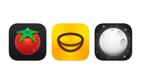
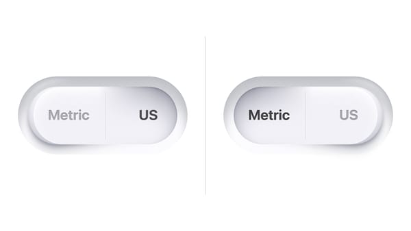
A recent example of one of Apple's own apps that doesn't strictly follow their guidelines is Apple Sports. It has rounded buttons in the navigation bar and a segmented controller for picking match day that has been styled to be completely text based. The absence of solid button shapes lets this app showcase the animated backgrounds. The Apple Sports logo sits in the navigation bar and behaves similar to a large title. In this case I imagine these are changes that felt right in this particular app, not necessarily something that will become standard patterns.
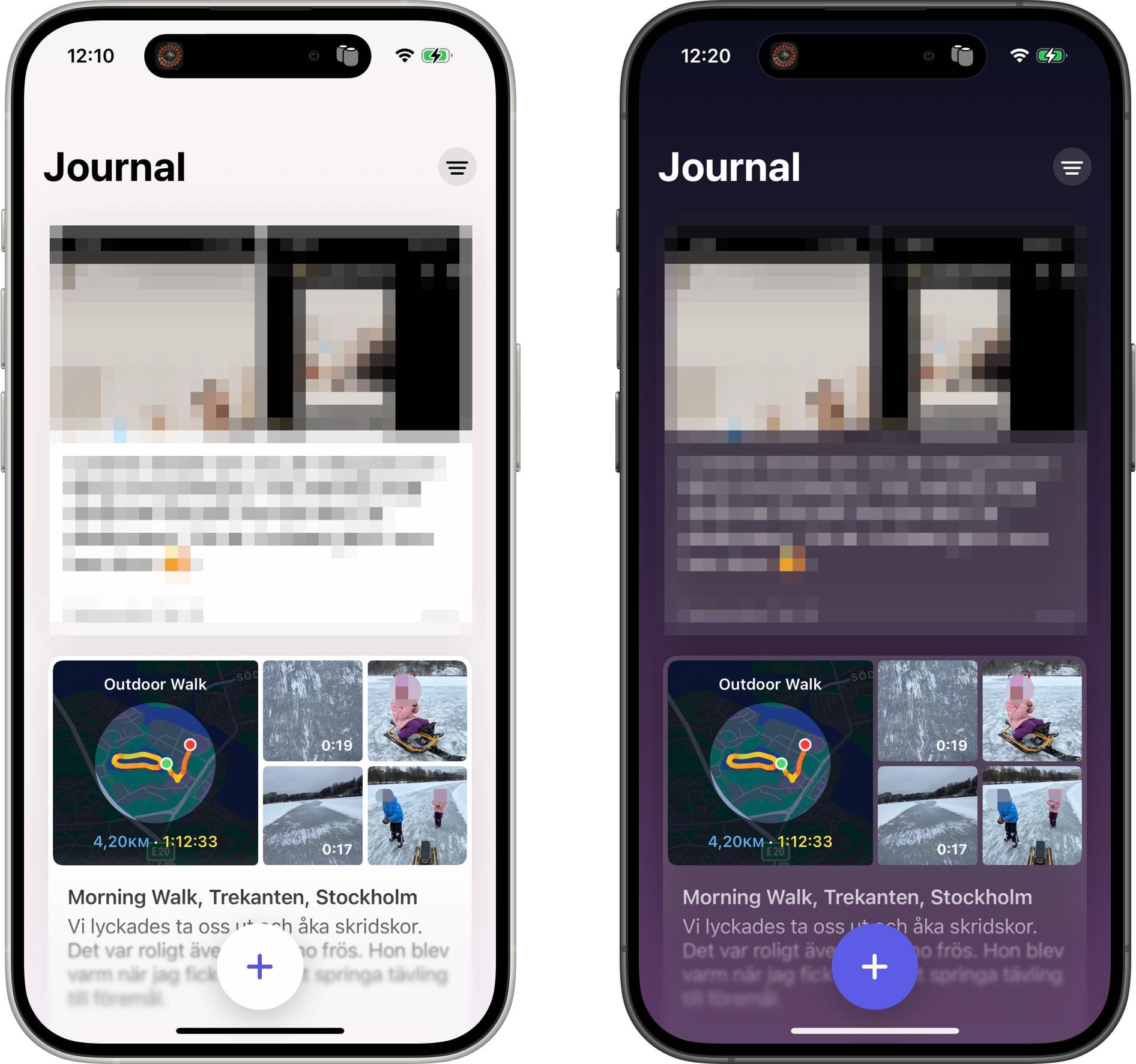
The Apple Journal app uses a large floating plus button at the bottom, with a gradual blur behind it, similar to my designs for Handla. Traditionally these buttons have been common place on Android, but here we see Apple trying a very prominent one on iOS. It felt right for this particular app to put a strong emphasis on writing a new journal entry.
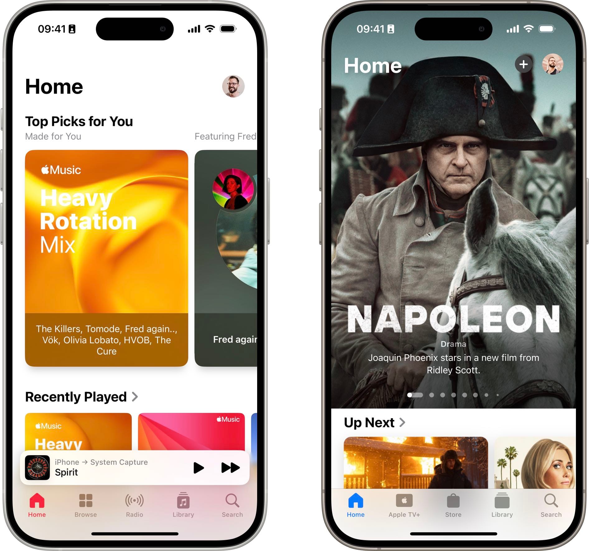
Apple also recently updated the Apple TV and Apple Music apps to have a Home label and icon for the first tab. Their guidelines specifically say not to use a generic term like home to describe a tab.
Use a succinct term for each tab title. A useful tab title aids navigation by clearly describing the type of content or functionality the tab contains. Aim for a single word or a very short phrase, like Music, Shared, Library, or For You. Consider avoiding a generic term like Home, which lacks specificity and can mean different things in different apps.
But perhaps it has become so common among other apps like Spotify and Netflix that Apple‘s product teams felt it was the right thing to do for their apps. It has become expected by users as a starting point in an app. If the design system becomes a hinderance for an app to deliver a better experience, then break the system. If it was the right call in this particular case is up for debate. If they stick with it, this is a change I’m sure will result in an updated HIG eventually.
A design system needs to be broken to remain healthy, to keep it from growing stale. Prioritize delivering on the value of your app rather than being consistent. Don't be afraid to question the design system you work in, regardless if it’s of your own making in a personal project or made by a whole team of designers in a large organization.
If you need help keeping your design system fresh and healthy, don't hesitate to reach out!